

Why We Love Benjamin Moore Collingwood
Benjamin Moore Collingwood (OC-28 or 859) is a standout paint color that has captured the hearts of homeowners and designers alike. This warm, versatile greige—a perfect blend of gray and beige—offers a timeless appeal that works beautifully in a variety of spaces. Below, we explore the reasons why Collingwood is a beloved choice for interiors and exteriors.
A Perfectly Balanced Greige
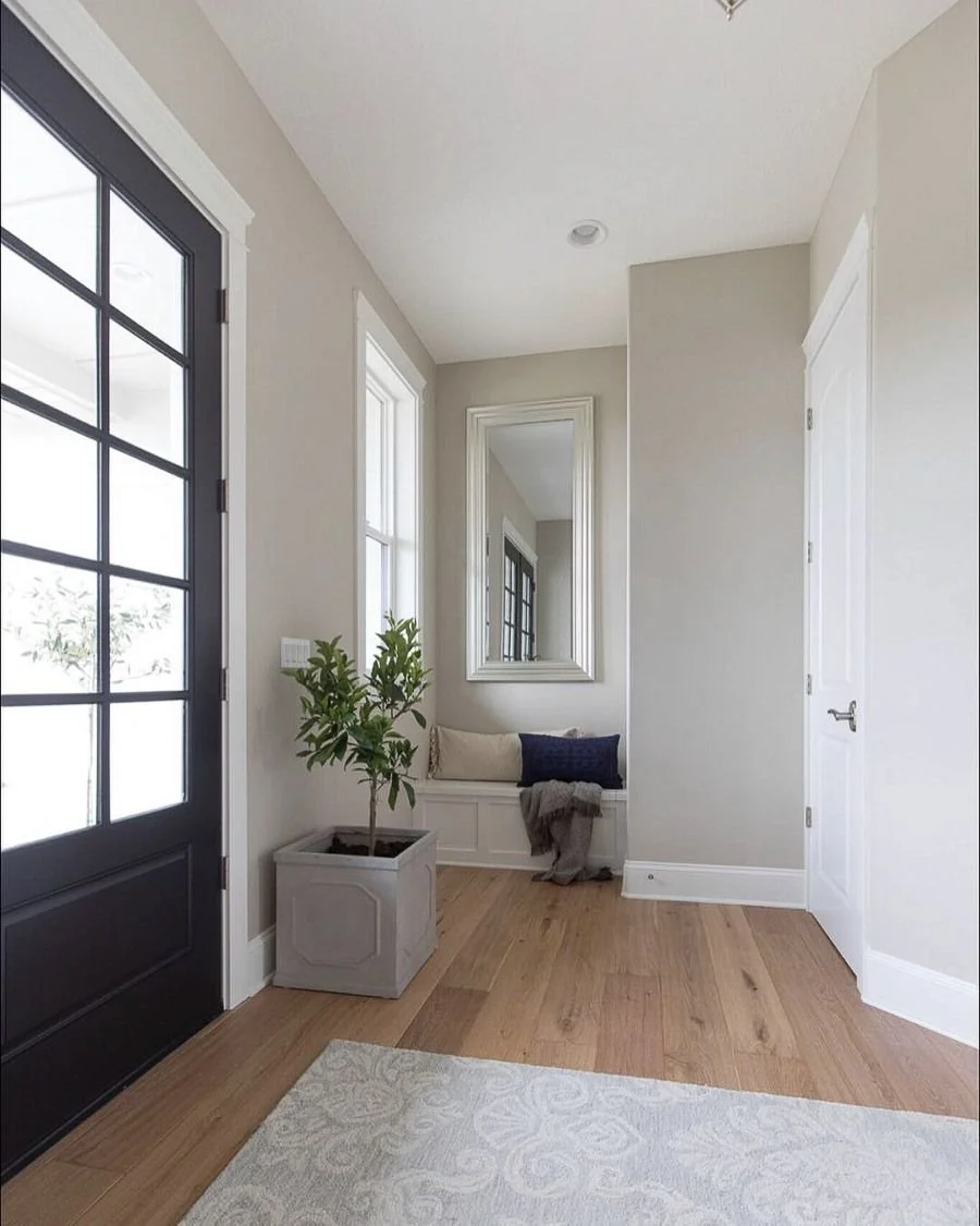
Collingwood’s unique ability to straddle the line between gray and beige makes it an ideal neutral. Unlike many grays that lean heavily blue or green, Collingwood maintains a sophisticated warmth with subtle violet undertones. This balance ensures it feels neither too cool nor overly warm, creating a welcoming and cohesive atmosphere in any room. Its Light Reflectance Value (LRV) of 62 makes it light enough to brighten spaces while still providing enough depth to feel substantial.

{pinterest}
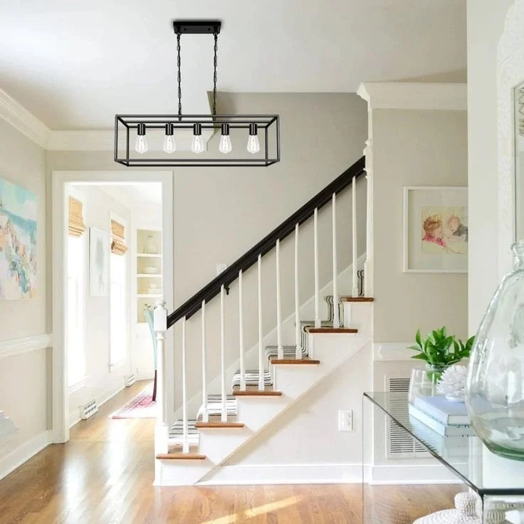
Versatility Across Spaces
One of Collingwood’s greatest strengths is its adaptability. It shines in a wide range of settings, from traditional to modern, farmhouse to coastal. Whether used as a whole-house color, on cabinetry, or as an exterior siding shade, Collingwood delivers. It’s particularly stunning in open-concept spaces, where its neutral tone creates a seamless flow between rooms. For example, it pairs beautifully with rustic wood floors or lighter coastal palettes, accentuating natural elements like stone or wood.
{pinterest}
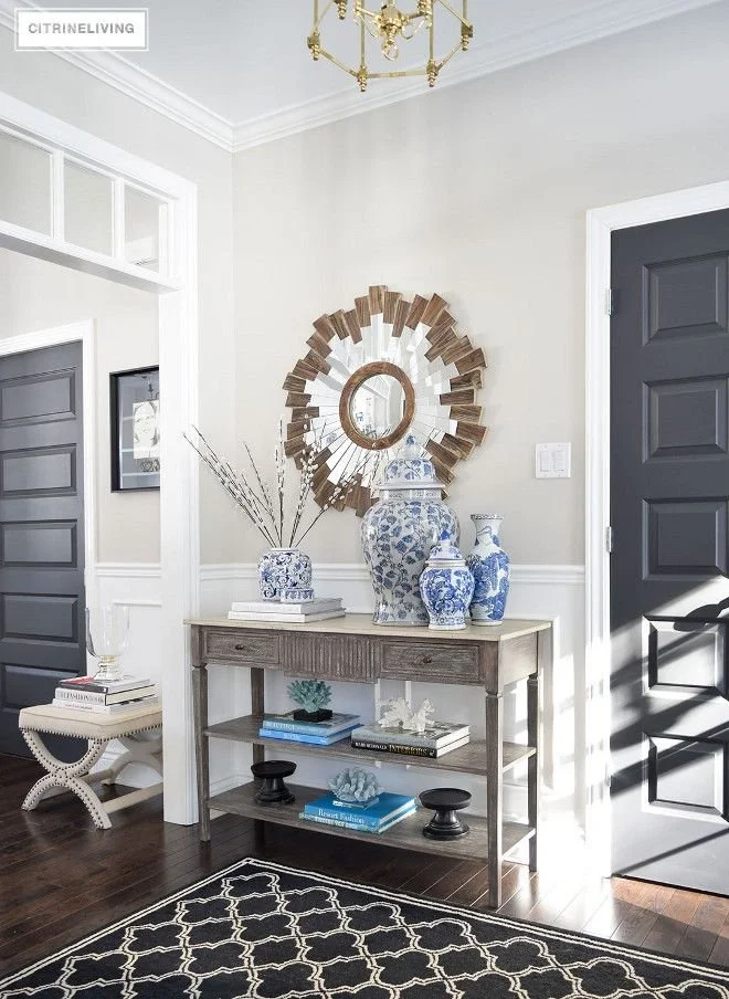
Plays Well with Other Colors
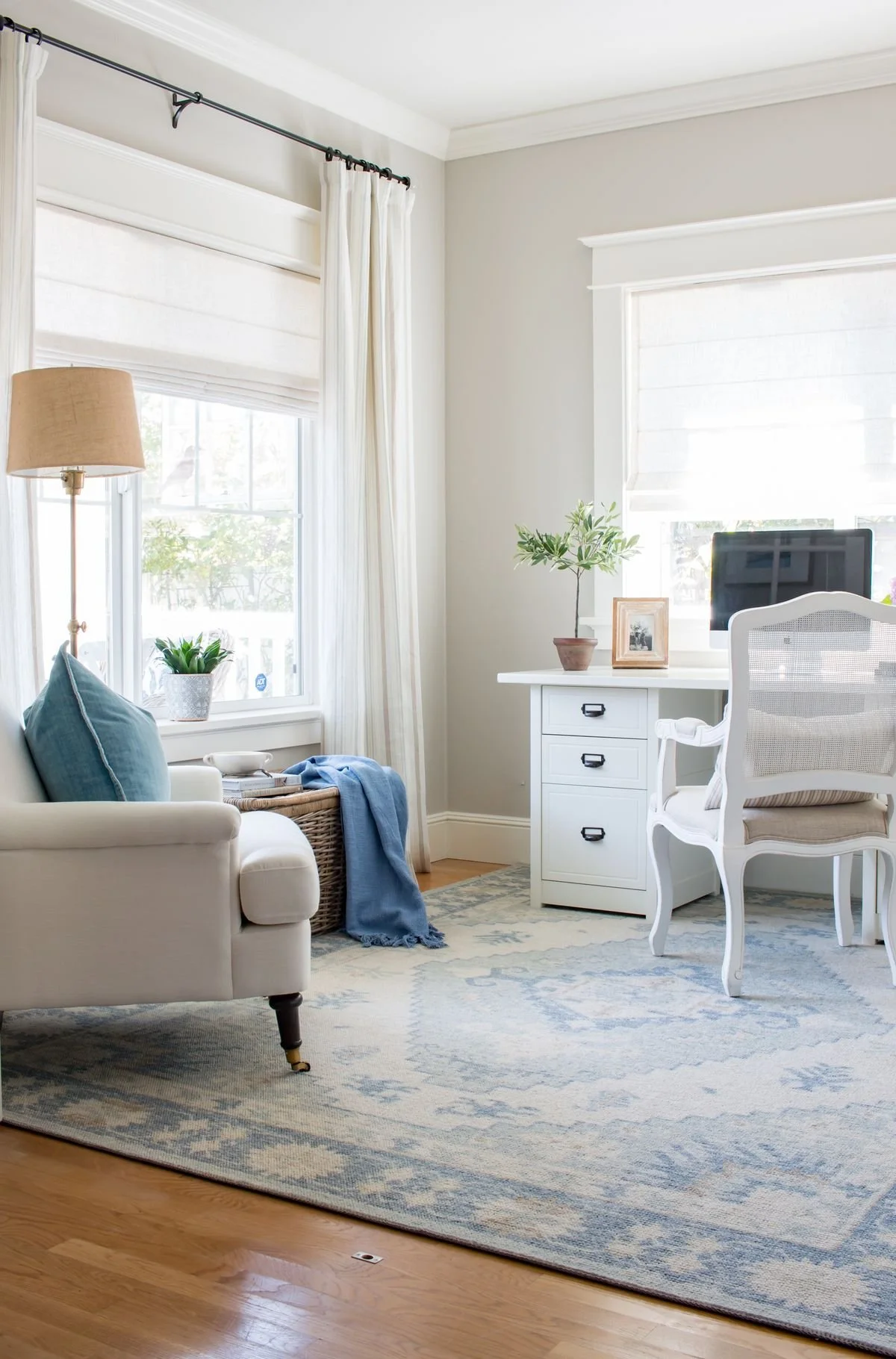
Collingwood’s subtle violet undertones make it a dream to coordinate with other hues. It pairs effortlessly with crisp whites like Benjamin Moore Chantilly Lace or White Dove for a clean, classic look. For a coastal vibe, combine it with blues like Palladian Blue or Hale Navy, or incorporate greens like Caldwell Green to highlight its warmth. It also complements bold accents like deep reds or soft pinks, making it a versatile backdrop for both neutral and vibrant palettes.
{pinterest}
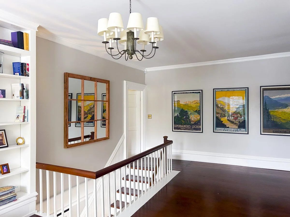
Performs Beautifully in Different Lighting
Collingwood’s ability to adapt to various lighting conditions is a key reason for its popularity. In south- or west-facing rooms with abundant natural light, it appears as a warm, luminous gray. In north-facing rooms, its violet undertones may become more pronounced, creating a cooler yet still inviting feel. This adaptability makes it suitable for homes in diverse climates, from sunny southern regions to shadier northern spaces. Always test a sample in your space to see how it behaves with your lighting.
{pinterest}
Timeless and Trend-Proof
While design trends come and go, Collingwood remains a classic choice. Its greige nature bridges the gap between the cooler grays of past trends and the warmer taupes and beiges making a comeback. This timeless quality ensures that spaces painted with Collingwood feel fresh and relevant for years to come, making it a smart investment for homeowners.
{pinterest}
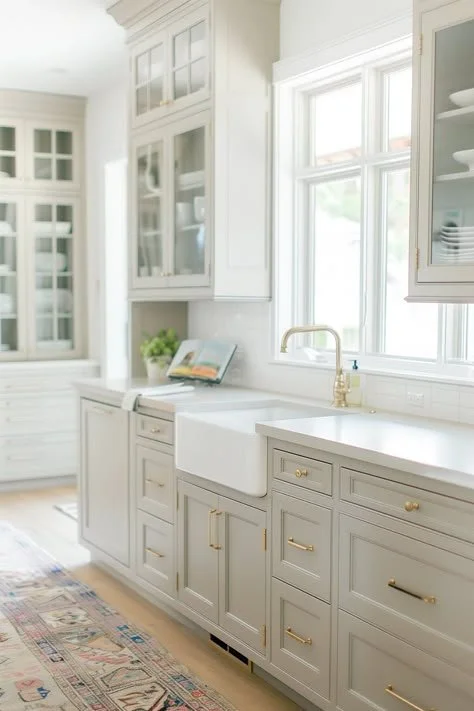
Ideal for Multiple Applications
Beyond walls, Collingwood excels on cabinetry, furniture, and even exteriors. Its semi-gloss finish on kitchen cabinets creates a polished, colonial-inspired look, especially when paired with antique brass hardware. As an exterior color, it complements natural stone and bold trim colors like Wrought Iron or Intercoastal Green, enhancing curb appeal with a sophisticated yet approachable vibe.
{pinterest}
Designer and Homeowner Favorite
Collingwood’s status as a best-seller in Benjamin Moore’s Classic Color and Off-White Collections speaks to its widespread appeal. Designers praise its ability to act as a “supporting actor,” allowing furniture, artwork, or architectural details to shine while providing a refined backdrop. Homeowners love its calming effect, making spaces feel serene yet stylish, whether in a cozy bedroom or a formal dining room.
[pinterest}
Tips for Using Collingwood
Test First: Paint a large poster board with a half-pint sample and move it around your space to observe how Collingwood looks in different lighting conditions.
Avoid Certain Pairings: Steer clear of green-gray colors like Revere Pewter, as their undertones can clash with Collingwood’s violet hues.
Choose the Right White: Pair with clean whites like Chantilly Lace or softer off-whites like White Dove to enhance its warmth without overwhelming it.
Consider Sheen: Use Benjamin Moore Aura in Matte for walls to hide imperfections and ensure washability, or opt for semi-gloss on cabinets for a polished finish.
Final Thoughts
Benjamin Moore Collingwood OC-28 is a warm, versatile, and timeless greige that elevates any space it graces. Its balanced undertones, adaptability to lighting, and compatibility with a range of colors and styles make it a go-to choice for creating sophisticated, inviting interiors and exteriors. Whether you’re refreshing a single room or transforming an entire home, Collingwood delivers a perfect blend of elegance and comfort.
Looking for help choosing the perfect paint colours? I offer personalized e-design services to make the process simple and stress-free—let’s find the right palette for your home!